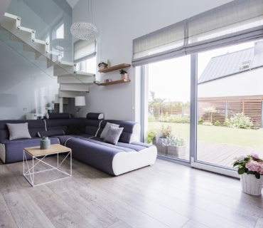
For small NYC apartments, match your shade color to your wall color to create visual continuity. Light neutrals—like Off-White, Whisper Gray, or Cream—have high Light Reflectance Value (LRV), bouncing natural light deeper into the room and blurring the boundary between window and wall, which effectively expands perceived square footage.
The “Shoebox” Challenge: Optical Illusions for NYC Living
In New York City, square footage is the ultimate luxury. Whether you are in a pre-war walk-up in the Village or a compact high-rise in Hells Kitchen, the wrong window treatment can make a room feel claustrophobic.
The strategic choice of shade color is not just about decoration; it is an architectural tool. By manipulating color temperature and opacity, you can visually push walls outward and lift ceilings higher.
Rule #1: The Power of Low Contrast (Visual Continuity)
The most effective trick for small rooms is Low Contrast Design. When a window shade contrasts sharply with the wall (e.g., a navy shade on a white wall), it breaks the visual plane. This stops the eye and clearly defines the room’s limits.
- The Strategy: Select a fabric within 1–2 shades of your wall color.
- The Result: The window treatment “disappears” into the architecture, creating a seamless horizon line that makes the room feel expansive.
- Best For: Studios, small living rooms, and spaces with low ceilings.
White vs. Off-White: Choosing the Right Neutral
White is the standard for expansion, but “White” is a spectrum, not a single color.
- Bright White: Best for modern, high-contrast spaces. However, in north-facing NYC apartments (which get blueish, indirect light), bright white can feel sterile or cold.
- Warm White / Cream: Ideal for apartments facing north or east. It counteracts the “gray” city light, adding warmth without shrinking the space.
- Light Gray / Greige: The modern alternative to beige. Perfect for south-facing windows where sunlight is strong, as it absorbs glare while maintaining a bright aesthetic.

When to Go Dark: The “Infinite Depth” Effect
Can you use dark shades in a small room? Yes, but with intent. Dark colors (Charcoal, Slate, Midnight Blue) absorb light. In a bedroom or media room, this creates a “cave-like” coziness.
- The Designer Trick: If you choose dark shades, ensure the frames or surrounding trim are sleek. A dark shade acts as a focal point—drawing the eye to the view outside rather than the wall. This works exceptionally well for Solar Shades in high-rises with skyline views, as darker fabrics actually provide better see-through visibility than white fabrics (which reflect indoor light and obscure the view).
Fabric Opacity: Color Changes with Light
The color you choose will look different depending on the opacity (how much light gets through).
| Opacity Type | Effect on Color | Best Application |
| Solar (1-5%) | Dark colors appear sheer; Light colors glow. | Living rooms with views; UV protection. |
| Light Filtering | Colors “glow” when backlit by the sun. | Kitchens & Living areas requiring privacy but light. |
| Blackout | Color remains true and solid, regardless of sun. | Bedrooms & Nurseries; blocking neon signs/streetlights. |
NYC Specific: Managing the “Brick Wall” View
Many NYC windows face a brick wall or an alleyway.
- The Mistake: Using a sheer or solar shade that shows the brick wall, making the room feel enclosed.
- The Solution: Use a light-filtering roller Shade in a translucent soft white. This obscures the ugly view but captures the daylight, turning your window into a glowing “lightbox” that simulates a better view.
Why Custom Fit is Critical for Small Spaces
In a small room, bulky hardware takes up visual space. Stock shades often require external mounting or have large, unsightly gaps.
Final Verdict: The Top 3 Colors for NYC Apartments
- Whisper White: The safest bet for maximum brightness and expansion.
- Pearl Gray: Sophisticated, hides city dust better than white, and reduces glare.
- Sand/Canvas: Adds warmth to pre-war apartments with wood floors.